Creating a Custom Theme
July 26th, 2010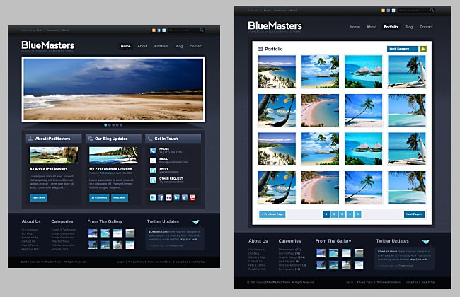
A professional-looking Web site is an essential part of representing your brand, telling your unique story, showcasing your talent and style to your clients. It will entice your visitors into exploring your work and will ultimately result in more sales. However, creating a portfolio Web site can be a daunting and expensive task that usually requires non-trivial expertise and a significant time investment.
Our vision is to deliver tools that allow photographers to focus on their creative expression. We believe that nothing should stand in the way of photographers’ talent, and that’s why we wanted to make it super easy for photographers to create custom portfolio web sites without any coding. Welcome to Zenfolio Theme Designer – an interactive tool that helps you customize your entire portfolio, online proofing, and shopping Web site with simple point-and-click.
In this blog post, I’d like to walk you through creating a custom theme for your Zenfolio web site and show how easy it is to customize your site to match your style. I assume that you are familiar with using the Customize Visitor View feature. (You can always rely on our Online Help for detailed instructions). It is also helpful to have some experience using an image editing applications, such as Adobe Photoshop.
Before you start designing a Web site, it is very helpful to have a vision of how the final web site should look. There are many places for inspiration on the web. There’s a great thread on Zenfolio forums where our photographers post their sites. Smashing Magazine is another source of inspiration with frequently updated articles dedicated to web design. This is where I found a good example of a professional web site template. The template, called BlueMasters, is published free for download and can be used in personal and commercial projects, so let’s use it as our vision for creating a unique Web site.

The BlueMasters template package includes PNG and layered Photoshop (PSD) files of several page types: home page, photo gallery page, blog page, contact page, and so on. This comes in very handy since we can use these pages for styling elements on corresponding Zenfolio Page Layouts. You can download all template files here.
The BlueMasters home page has a dark background while all other pages place content on a white mat. To accommodate for this, you will need to create two custom Themes and apply one to the Home Page and another one to all other Page Layouts.
Preparation
Before creating a custom Theme, you need to complete a few preparatory steps, so that your site has a finished look.
- Complete the public profile information: write a short welcome message, add your bio, or the information about your business, uploaded your photo, and enter the contact information.
- Prepare two versions of the logo: a large one to be displayed on the Home Page and a small one displayed in the header of other pages. When working on your logo, keep in mind the background and color palette of your Web site, to make sure that your logo is visible and its colors do not clash with the colors of your site. Save logos as PNG files with alpha channel (transparency), so that they can be placed on the page background. BlueMasters template has the dark background, so you can create a logo by using white letters with a slight gradient effect. It will match the logo provided in the template.

- Finally, while the custom Theme is in the works, apply a simple dark Theme to the Web site, for example use Fine Art – Black Theme from the collection of Zenfolio Themes.
Home Page Layout
A clean, simple layout is the first step towards having a professional-looking Home Page. Let’s choose a Page Layout that is closest to the template we are trying to recreate. In this case, it is Portfolio Layout B, which most closely matches the layout suggested by BlueMasters home page template.
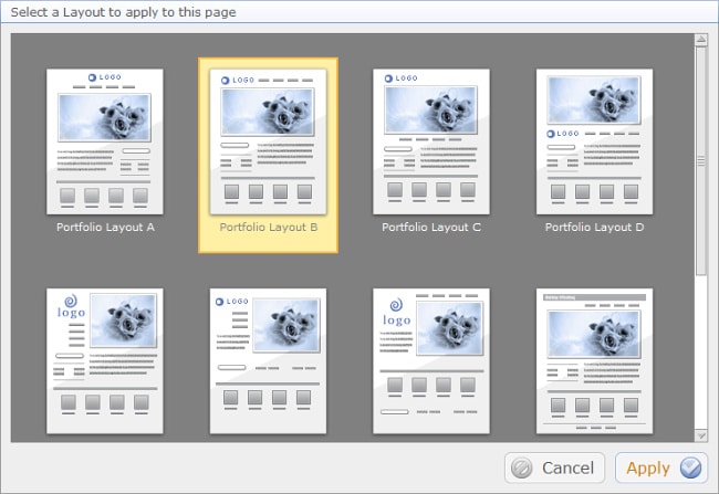
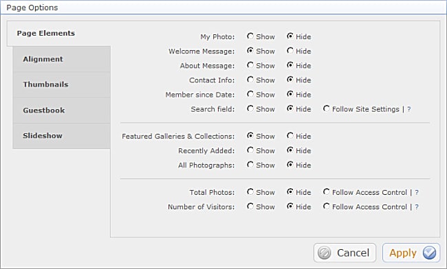
After selecting the Layout set the Page content width to “fixed” in the Alignment tab of the Page Options popup. This way the Slide Show will not resize when the browser window is resized. This Layout is preferred when you want the page content to be laid our predictably in all browser window sizes. (If you want your Home Page Slide Show images to take all available screen space, regardless of the browser window size, you can set the layout to dynamic. However, other page elements may change their position and size).
The next step is to configure the Site Menu. It is a good practice to have no more than six menu items, so that your visitors are not overwhelmed by all the choices. Here’s the menu items typical for a portfolio Web site: About, Contact, Portfolio, Blog, etc.
Now let’s move to setting up the Home Page Slide Show. The Slide Show is one of the most critical elements of your Home Page. This is the first and the largest element and it deserves careful attention to every detail. The dimensions of the Slide Show frame are determined by the aspect ratio of the first image. I recommend carefully hand picking the images that will be used, putting them into a separate Gallery, and cropping them to the same aspect ratio. If all images have the same aspect ratio, they will display nicely, without showing any empty space around them.
Our BlueMasters template suggests making them slightly panoramic, so you can resize all Slide Show images to about 1500 x 800 pixels. Slide Show options, such as timing, transitions, and a music soundtrack are selected after choosing which gallery will be used.
The next step is to select which elements will appear on the Home Page. To keep the Home Page simple and clean, keep the minimal number of Page Elements: logo and Menu, Slide Show, Welcome Message, and Featured Galleries. Other pages will be displayed on pages linked from the site Menu.
Useful tips:
- If you want to display portrait images in your Slide Show, just stitch two or three of them together in Photoshop to make one panoramic image.
- Another nice touch would be to pick cover images for featured galleries to also have the same aspect ratio. Images will be nicely aligned, adding to the professional, polished look of your site.
- When working on your custom Theme, open your site in another browser window and refresh it after making changes – this is a quick way to see how your changes affect your site.
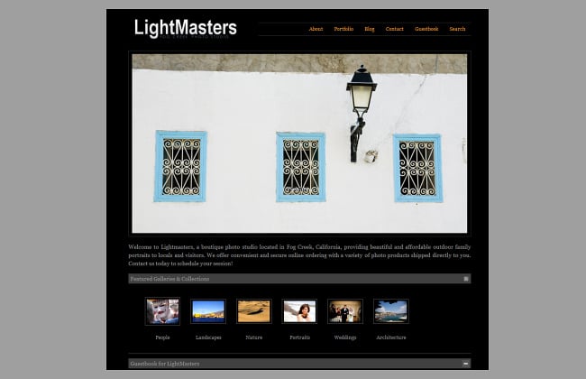
Here’s how the Home Page looks before starting the work on Theme customization.
Designing a Home Page Theme
When the desired Layout is in place, you can proceed to creating the custom Theme for the Home Page. Click Page Theme -> Create New Theme. Select a dark purple background – it is the closest one to our template, and the Theme Designer will open.
The Style Tab of the Theme Designer allows defining the overall look of the Theme. After selecting the main page color using the color wheel, the Theme Designer automatically generates several color palettes with colors that look good together. Page Elements that you preview and customize here, on the Style tab, define the look for all other Elements on all Page Layouts. You can simply rotate the color wheel and play with the brightness/saturation until you see a combination of colors that you like, save the Theme, apply it to your site, and you have your own unique design to for your site. It is that easy!
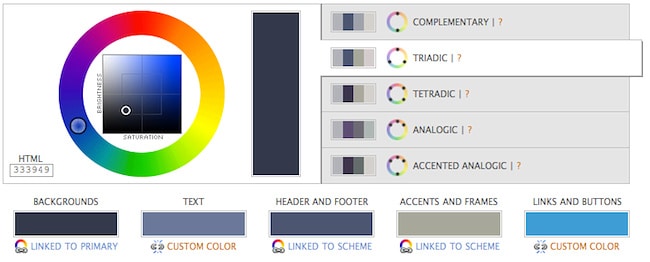
However, creating the Theme that matches the BlueMasters template, requires overriding the colors suggested by the Theme Designer with the colors from the template. You’d need to read color values from the BlueMasters template and use these colors for Page Elements in the Theme Designer. There are various tools for reading color values, such as color picker in Photoshop, Digital Color Meter on the Mac, etc. The Theme Designer requires color values as HEX codes (a.k.a HTML color values). Start with the page background color, which, for this case, turns out to have the hex code of #333949. Type this value into the box under the color wheel, and the color scheme for the site was automatically generated. Click on color scheme colors boxes (text, header and footer, accents and frames, links and buttons) and put color values that you get from corresponding parts of the template page.
At this point you might be wondering about the nice background graphics used in the template. We will add it later – for now we need to make sure that other colors look good on the background.
Now, you will need to set colors and styles for all other common elements that you see on the Styles tab. Click Page Elements (photos, buttons, headers, lines, etc.), get color values from the template, and set the colors of the corresponding Elements.
The next step is to set font styles, also working to match the style of the fonts used in the BlueMasters template. To check your progress save the new Theme, assign it to the Home Page, and preview it in another browser window.
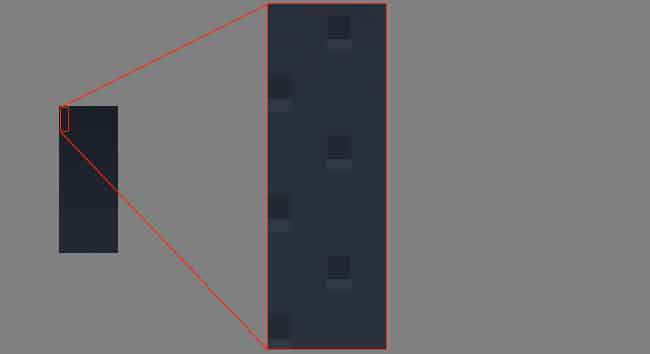
Using custom graphics is a key to giving your Web site a truly unique, handcrafted look and feel. The BlueMasters template uses a page background image and also uses custom graphic elements for page sections. To create these graphic elements open the BlueMasters home page template in Photoshop (or in your favorite image editing application). Copy a narrow tall section of the background from the BlueMasters’ page background and make sure that the image will result in a seamless pattern when tiled horizontally.
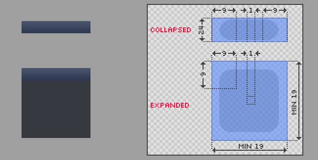
Page Sections used in Zenfolio Layouts have a header and can be in two states: expanded and collapsed. You will need to create two images, one for the expanded page section, and another for the collapsed one. The expanded Page Section looks like a semitransparent box with the header on top. The header should have the height of 24 px, and minimum dimensions of the box should be 19 x 19 px.
After you upload the image, Zenfolio Theme Designer will automatically slice your image into 8 pieces: 4 corners and 4 middle elements – this is needed to display Page Sections of various widths. You just need to make sure that the image you provide complies with specifications shown in the Upload popup:
Once your images for the Page Background and for the Page Sections are done, you are ready to open the Elements tab of the Theme Designer and upload your images. Click on Page Background, click the pencil icon next to the Image in the Toolbox, and select the Upload Your Image tab in the popup.
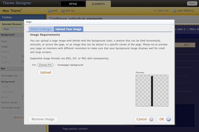
After the image is uploaded select the option to repeat it horizontally and to not scroll with the page. Follow the same steps to customize the Page Section with the custom graphics.
The rest of the work is to carefully walk through all Page Elements that are used on your Home Page and set their colors and fonts to match your template as closely as possible. Note that unless you are trying to create a Theme that will be used with all Page Layouts, you do not need to style Elements that are turned off on your Home Page. For example, since the example Home Page does not use the vertical Home Page Menu, there’s not need to style it. The completed Home Page should look similar to this.
Custom Theme for Other Page Layouts
After the Home Page is ready, you need to create the second custom Theme which will be applied to other pages of your site. As a reminder, the second Theme is needed where the “mat” will be used to place page content. The process is the same as for creating the first Theme. Let’s start with putting together the Page Layout, and then we will create the custom Theme.
Pick a Group and a Gallery that will be used to preview my newly designed Theme. Add all metadata such as titles, captions, and keywords. Add a few test entries to Guestbook and a few comments to the photos. This will allow previewing all Page Elements when the custom Theme is applied.
If you plan to sell your work, I also recommend enabling print ordering, so you can preview how the Add to Cart window looks when the custom Theme is applied.
This is how Gallery and Photo Pages look before customizing the Theme:
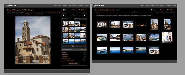
After the Layout is ready, we can can move on to creating the Theme. The Gallery Page from the BlueMasters template will be the reference for creating the Theme: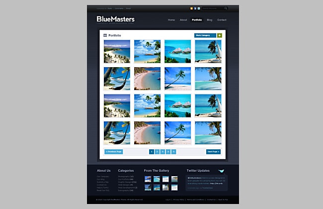
The new Theme will use the same graphics for the Page Background as used in the Home Page Theme. In addition, we will need to create two new custom graphic elements: page mat and page header.
The page mat is a white rectangle with dark, semi-transparent border.
Theme Designer will automatically slice the image supplied for the page mat into 8 pieces needed to display mats for varying browser window sizes. The image should have the dimensions as shown:
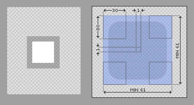
The page header is a simple dark rectangle with a slight gradient that will be tiled horizontally. It should have the height of 42 px.

The next step is to create a new Theme. This time, after opening the Theme Designer, set the background color to white in the Style tab. Here’s why: while the page background is dark, same as on the Home Page, the Gallery Page content appears on the white mat, so we need to pick colors for Page Elements that make them visible on the white background of the mat.
As before, start working on the theme by customizing all Elements on the Style tab of the Theme Designer. You need to set colors, fonts, and other values to match the look of the pages in the BlueMasters template. Preview your changes often, preview them on different page types, and don’t be afraid to experiment. If something in the template does not look the way you want – change it! It is your web site, and Theme Designer gives you the power to make changes quickly.
When all Elements on the Style Tab are customized, save your Theme and switch to the Elements tab. Start with configuring the Page Background with the custom image. Also, set custom image for the page header. Then enable the Page Mat, upload your custom image, and set the mat background color to transparent.
Lastly, you need to go through Page Elements and style them to match the template. While making changes on the Elements tab it is important to preview all pages that will be using the Theme: Group page, Gallery Page, Photo Page, Guestbook, Search results page, About Page, and Contact page. Don’t forget to check the styling of various popups, such as Share and Add to Cart. Note that not all elements that you see on your pages can be directly styled from the Theme Designer. To save you time, Theme Designer automatically sets styling for many Elements by inheriting settings from other Elements displayed on the Style or on the Elements tabs of the Theme Designer.
Click the links below to view the finished theme:
Home Page | Gallery Page | Photo Page | About Page
The last step is to save your Theme and to apply it to your Pages. The unique custom Theme is ready, and it has been created without any HTML or CSS coding. Theme Designer even helped you with preparing your graphic elements, so fluid layouts of your pages work with all browser window sizes.
In summary, here are a few key points to keep in mind when creating a custom Theme:
- Always configure all the Elements on the Style tab of the Theme Designer before moving to configuring individual Elements on the Elements tab – this will ensure that all Elements are styled consistently.
- Preview your changes often by opening the page with the Custom Theme applied in another browser window.
- Take advantage of using custom graphic elements such as backgrounds, decorations for thumbnails and large images, headers, etc. They will give the unique, hand-crafted look to your custom Themes. If creating them in Photoshop intimidates you, there are many inexpensive page backgrounds and other elements that can be purchased online.
- When creating your own Theme, take advantage of colors suggested by the Theme Designer – they are selected to work well together and ensure good contrast and readability of text on your pages.
I encourage you to get familiar with the Theme Designer. You can create as many Themes as you want, experiment with preset graphics, play with color palettes, upload your custom page backgrounds, and get feedback from others. You can create a custom Theme for each client, giving them unique viewing experience that matches their specific event.
We’ve made it very easy for you to design your site with no coding, so it is all up your creativity to come up with a truly unique design that reflects your unique talent!

