Product Spotlight; Fundy Album Builder v6
June 23rd, 2014
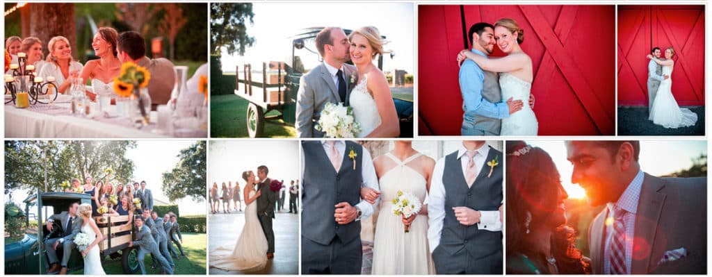
I have no great love for designing wedding albums. If it were up to me, I’d shoot and edit a wedding without ever thinking about an album. That being said, an album can make a lasting impression on a couple that gives their wedding photos staying power. Thus, albums are here to stay, and they’ve become an important part of presenting images to a couple.
One of the hardest parts about offering albums can be the design software, so to be honest, when I was asked to review Fundy’s Album Builder v6, I was a bit hesitant. I’ve heard good things about it, but it would mean learning yet another design software when I’ve already learned such design programs as Queensberry Photo Junction, Adobe InDesign, Miller’s Designer Plus, and Graphistudio GraphiSoftware. I’m glad I did though because Fundy’s sixth and newest version of Album Builder seems to have figured out how to streamline the design process without sacrificing too much control.
Unlike past iterations of Album Builder, which were plug-ins for Photoshop, Fundy made version 6 a stand-alone program. Inevitably, there was a steep learning curve with Fundy’s Album Builder v6, but I was impressed that Fundy had a surprisingly accessible video help section with “quick and dirty” tutorials.
The fundamental difference I found between Fundy’s Album Builder and every other album design software is that Album Builder works primarily with groupings of photos rather than single images. These groupings of photos are aptly named drop zones. I could adjust the size of each drop zone and drop (hence the name) any number of photos into the space, and the drop zone would automatically arrange the images into a smart looking layout. I would drop another image into the zone and it would redistribute to fit nicely among the others. If I didn’t like the layout, I could swap photos, shuffle them, or try a different layout entirely. I could even have multiple drop zones on the spread to show separate groupings of photos rather than one big, long spread.
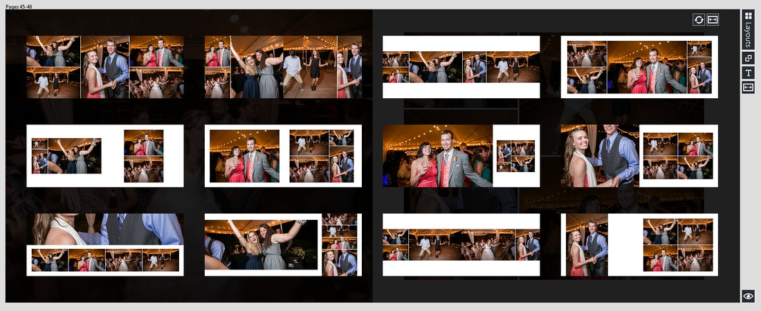 At first, I was not a fan of Album Builder’s drop zones since it was so engrained in me to deal with individual photos and preset layouts for specific photo orientations. Drop zones felt too automated, as if I was sacrificing my artistic license and creative control. However, Album Builder does let you control the layouts, but not how I expected. Instead of setting the alignment, spacing, size and location of images on a spread, I could indicate the size and location of a drop zone and then adjust the drop zone settings to apply to all the contained images at once. This meant that although I started with an auto-filled layout, I could customize it to fit my creative style.
The benefit I found in using drop zones was that I could add or remove an image with different orientations or a different crop and the drop zone would automatically lay out the photos according to my drop zone settings. As I quickly wrapped my brain around this different way of designing an album, it actually felt easier once I got the hang of it. With less time spent arranging the layouts, I felt free to drop images onto a page and select the best layout. If there wasn’t a perfect layout available for those photos, I would simply pick the closest one and then tweak the settings to get it just right. This enabled me to design the album in half the time it would normally take me.
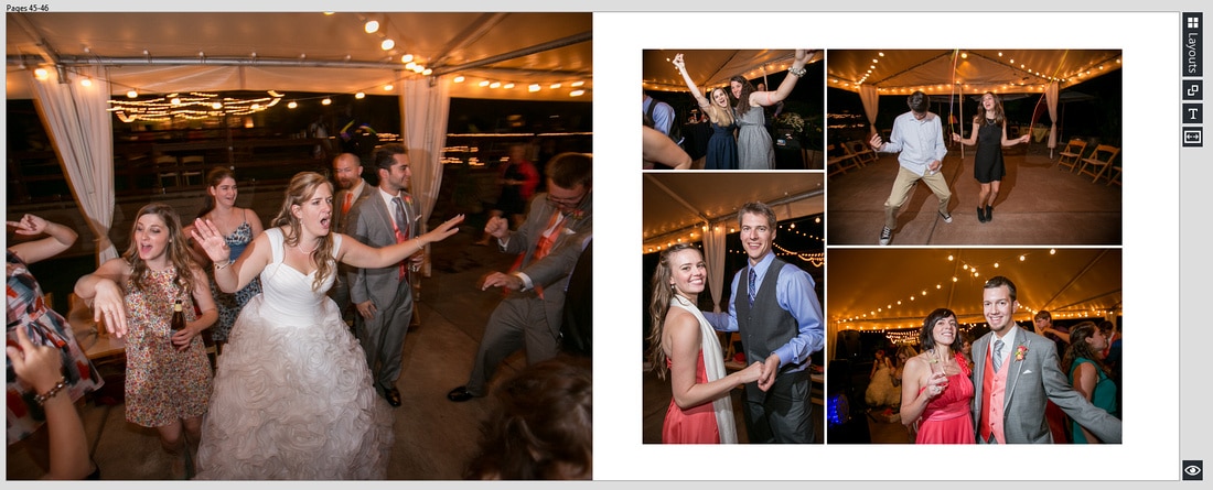
Even with all those sleek looking layouts at my disposal, I still ran into a hiccup. The project I was designing for a client was actually a book with a gutter, rather than my normal lay-flat album where the images can go edge to edge without fear of losing a subject’s face in the binding gutter. This posed a real issue since all of the auto-generated layouts gorgeously used the center space, counting on the fact that there wouldn’t be any binding gutter. This forced me to get better acquainted with the fine-tuning options of the drop zones. This definitely slowed me down, and I wouldn’t recommend using this software if you are offering books that are bound with a gutter.
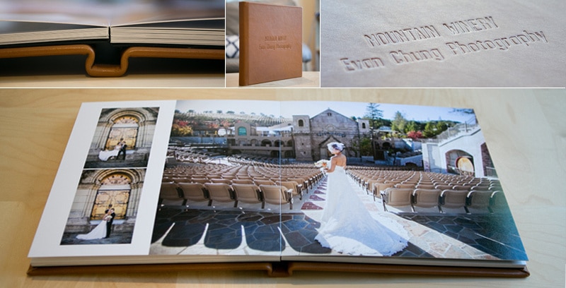
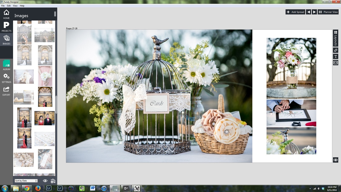 Considering the extra work it took me to avoid the gutters, I thought I’d give it another try with another client’s lay-flat album (no gutter this time). This was total success. Not only was I more experienced for the task after the first book, but I could really utilize the auto-generating layouts with only minor adjustments along the way. This second album took me half the time it took to lay out the first book, which means, for lay-flat albums, my normal design time was reduced by 75%. That might be stretching it a tiny bit, but in truth, I liked this album layout so much that I ordered an extra as a studio sample.
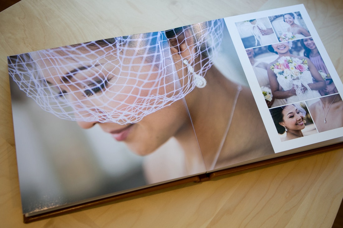 The final albums were gorgeous, and I would certainly recommend Fundy Album Builder v6 to those in search of a streamlined album design process. I’ve used many album designer programs, and this was by far the most enjoyable experience. Cheers to more album sales and to the ever-improving album design process.

Evan Chung is a natural people person, and loves working with couples to document their most important moments in life. Specializing in engagement and wedding portraits, his beautiful and engaging images showcase his love for people and capturing emotions on camera. It is easy to see his dedication to his craft and his ongoing effort to always capture that oh so perfect shot. Check out his work at his website: https://www.evanchungphoto.com/


